Every kilobyte counts on the modern web. Studies show that visitors abandon pages that take longer than three seconds to load — and images are usually the heaviest part of any page. That is exactly the problem WebP solves: it is an image format built to make photos and graphics dramatically smaller without visible quality loss.
What exactly is WebP?
WebP is an image format developed by Google, first released in 2010. It is based on the VP8 video codec and uses far smarter compression techniques than the 30-year-old JPG standard. The result: lossy WebP images are typically 25-34% smaller than comparable JPGs, and lossless WebP is about 26% smaller than PNG.
Lossy, lossless and everything in between
WebP supports two compression modes. Lossy mode trades a small amount of quality for big file savings — perfect for photos. Lossless mode keeps every pixel identical, like PNG, while still being smaller. On top of that, WebP supports full transparency (the alpha channel) and even animation, which makes it a modern replacement for GIF as well.
Do all browsers support it?
Today roughly 97% of browsers in use can display WebP images, including Chrome, Edge, Firefox, Safari 14+ and every modern mobile browser. For the remaining audience, websites simply serve a JPG fallback using the HTML picture tag.
How do I create WebP images?
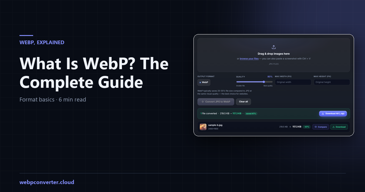
The easiest way is a converter tool. Open the JPG to WebP converter, drop your files, keep the quality around 80 and click convert. Your images never leave your device, and you can download all of them at once as a ZIP.
The bottom line
If you run a website, blog or online store, switching to WebP is one of the fastest wins available: smaller files, faster pages, happier visitors and better search rankings — all without touching your design.